Stellar Classification - SDSS17

Stellar Classification - SDSS17
Since I was a child, one of the topics I’ve always been fascinated by is space. The vastness of the universe, the mysteries of the galaxies, and the beauty of the night sky has always kept my curiosity. In the world of astronomy, one of the fundamental tasks is the classification of celestial objects, and the “Stellar Classification Dataset - SDSS17” provides an exciting opportunity to explore and understand the spectral characteristics of Stars, Galaxies, and Quasars. This dataset, based on observations from the Sloan Digital Sky Survey, contains a lot of information that açllow us to classify these objects and delve into the wonders of our cosmos. Let’s embark on this astronomical journey and analyze this dataset.
Metadata Dataset
Context - SDSS17
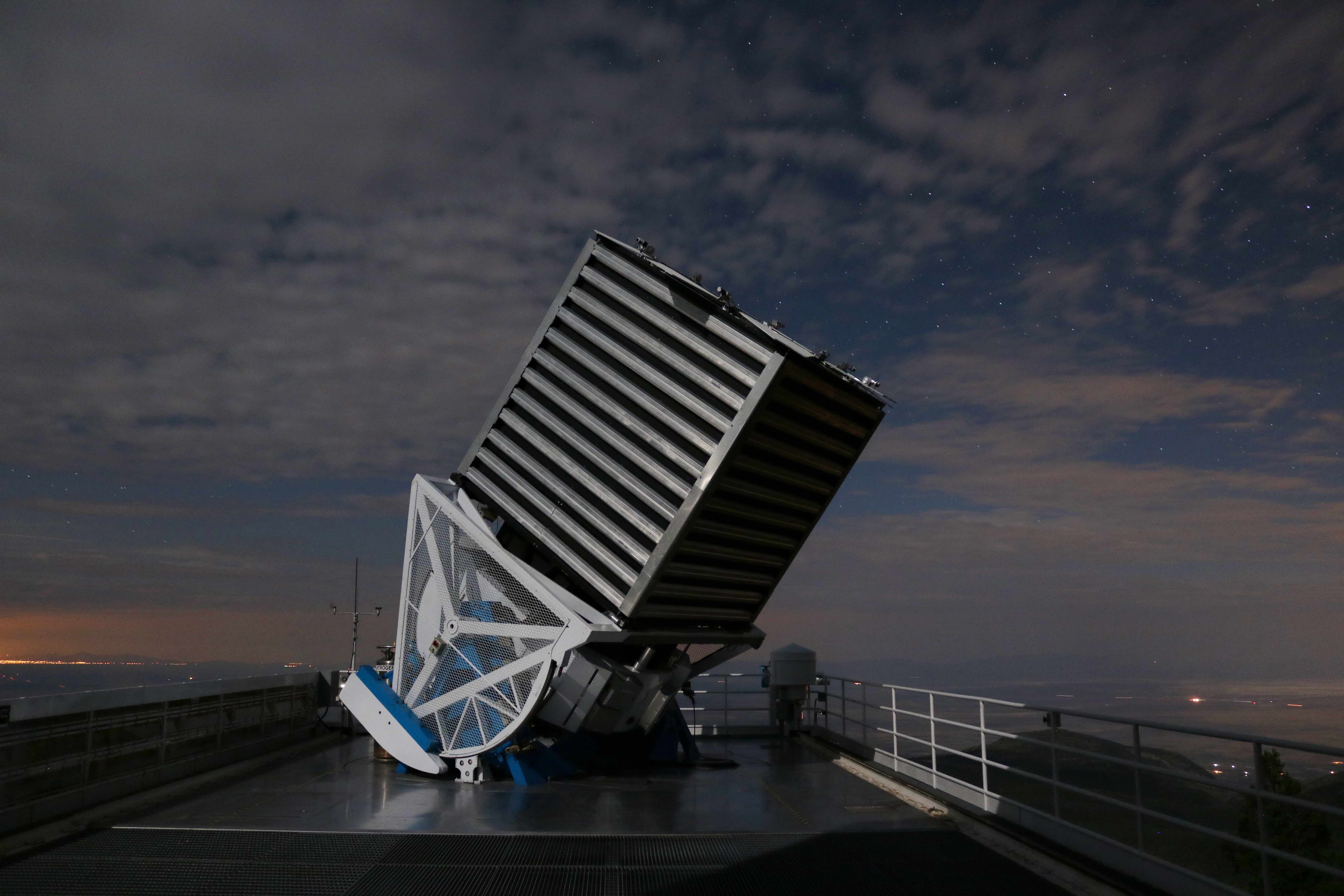
The Sloan Digital Sky Survey (SDSS), often referred to simply as SDSS, stands as a monumental achievement in the field of astronomy, a pioneer in unlocking the secrets of our vast cosmos. This multi-spectral imaging and spectroscopic redshift survey is conducted using a dedicated 2.5-meter wide-angle optical telescope located at the Apache Point Observatory in New Mexico, United States. Since its inception in the year 2000, SDSS has fundamentally transformed our understanding of the universe.
At its core, SDSS was built upon groundbreaking instrumentation and data processing techniques. It utilized a multi-filter/multi-array scanning CCD camera to efficiently capture high-quality images of the night sky. These images were complemented by a multi-object/multi-fiber spectrograph capable of simultaneously obtaining spectra from numerous celestial objects.
One of the project’s significant challenges was dealing with the unprecedented volume of data generated nightly by the telescope and instruments. This data was eventually processed, leading to the creation of extensive astronomical object catalogs, available for digital querying. SDSS played a pivotal role in advancing massive database storage and accessibility technologies, making its data widely accessible over the internet—a concept relatively novel at the time.
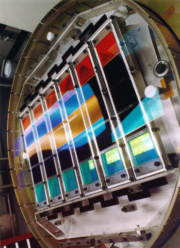
The imaging camera collects photometric imaging data using an array of 30 SITe/Tektronix 2048 by 2048 pixel CCDs arranged in six columns of five CCDs each, aligned with the pixel columns of the CCDs themselves. SDSS r, i, u, z, and g filters cover the respective rows of the array, in that order. The survey operates the instrument in a drift scan mode: the camera slowly reads the CCDs as the data is being collected, while the telescope moves along great circles on the sky so that images of objects move along the columns of the CCDs at the same rate the CCDs are being read.
Content - SDSS17
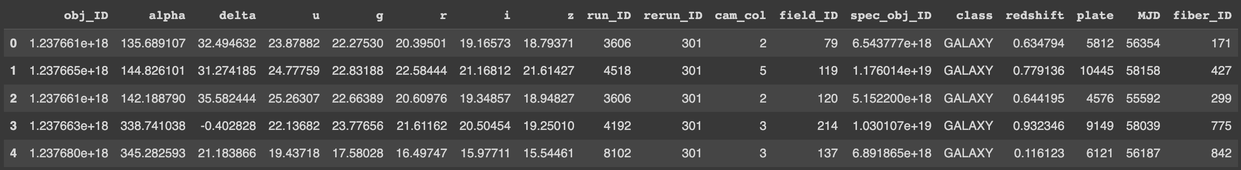
The dataset comprises 100,000 observations of celestial objects captured by the Sloan Digital Sky Survey (SDSS). Each observation is characterized by 17 feature columns and 1 class column, which categorizes the object as either a star, galaxy, or quasar.
Here’s a detailed description of the dataset columns:
obj_ID (Object Identifier): This is a unique identifier assigned to each object in the image catalog used by the CAS (Catalog Archive Server).
alpha (Right Ascension angle): The right ascension angle, measured at the J2000 epoch, specifies the east-west position of the object in the sky.
delta (Declination angle): The declination angle, measured at the J2000 epoch, specifies the north-south position of the object in the sky.
u (Ultraviolet filter): The u-filter corresponds to the ultraviolet portion of the photometric system and provides information about the object’s brightness in this range.
g (Green filter): The g-filter corresponds to the green portion of the photometric system and measures the object’s brightness in the green wavelength.
r (Red filter): The r-filter corresponds to the red portion of the photometric system and measures the object’s brightness in the red wavelength.
i (Near Infrared filter): The i-filter corresponds to the near-infrared portion of the photometric system and measures the object’s brightness in this range.
z (Infrared filter): The z-filter corresponds to the infrared portion of the photometric system and provides information about the object’s brightness in the infrared wavelength.
run_ID (Run Number): This is a unique identifier used to specify the particular scan during which the observation was made.
rereun_ID (Rerun Number): The rerun number specifies how the image was processed, indicating any reprocessing or modifications applied to the data.
cam_col (Camera Column): The camera column number identifies the specific scanline within the run.
field_ID (Field Number): The field number is used to identify each field, which is a specific region of the sky.
spec_obj_ID (Spectroscopic Object Identifier): This is a unique identifier for optical spectroscopic objects. Observations with the same spec_obj_ID share the same output class.
class (Object Class): This column categorizes the type of celestial object observed, including galaxies, stars, or quasars.
redshift: The redshift value is based on the increase in wavelength and is a critical measure for understanding the motion and distance of objects in the universe.
plate (Plate ID): The plate ID identifies each plate used in the SDSS. Plates are physical objects with holes drilled in them to allow fibers to collect light from celestial objects.
MJD (Modified Julian Date): MJD is used to indicate when a particular piece of SDSS data was collected, providing a precise timestamp for each observation.
fiber_ID (Fiber ID): Fiber ID identifies the specific fiber used to point light at the focal plane during each observation. This allows the SDSS to collect light from different objects simultaneously.
Input data
The first step to make is import our libraries that we will use throughout the document, as well as check if it was loaded correctly printing the first lines of the dataset.
1
2
3
4
5
6
7
8
9
10
11
12
13
14
15
16
17
18
19
20
21
22
import numpy as np
import pandas as pd
import matplotlib.pyplot as plt
import seaborn as sns
from sklearn.neighbors import LocalOutlierFactor
from sklearn.preprocessing import LabelEncoder
from imblearn.over_sampling import SMOTE
from sklearn.linear_model import LogisticRegression
from sklearn.neighbors import KNeighborsClassifier
from sklearn.preprocessing import MinMaxScaler
from yellowbrick.classifier import ConfusionMatrix
from lightgbm import LGBMClassifier
from sklearn.model_selection import train_test_split


from sklearn.model_selection import StratifiedKFold
fold = StratifiedKFold(n_splits=4, shuffle = True, random_state=42)

from sklearn.metrics import recall_score

from warnings import filterwarnings
filterwarnings(action='ignore')
1
2
df = pd.read_csv("star_classification.csv")
df.head()
Here is some additional information about this dataset, rows, statistical information, among others.
1
df.shape

Adjusting the label
1
df.info()
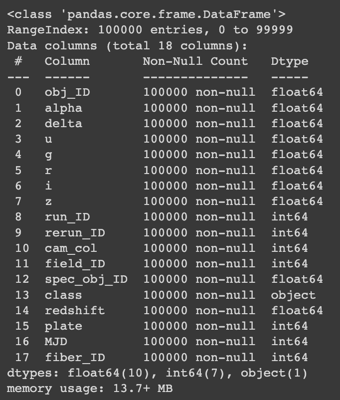
The observation at watching at this data is that the label it of type object, something we change it to numerical to be able to use it in models in the future.
1
df["class"]=[0 if i == "GALAXY" else 1 if i == "STAR" else 2 for i in df["class"]]
With this code we will change “GALAXY” to number 0, “STAR” to number 1, and “Quasars” to number 2. We can also see in the information table that in 100,000 rows no value is missing, an excellent piece of news.
Outliers
When we approach the outliers in such a big dataset, we have to be more careful, that’s why I decide to use a more robust approach, the outlier detection algorithm its Local Outlier Factor (LOF). The idea of LOF is to compare each data point to its nearby neighbors. It calculates how far each point is from its neighbors and checks if a point is much farther away from its neighbors than they are from each other. If it’s significantly farther, it’s considered an anomaly or outlier. If it’s not much farther, it’s considered a normal point. LOF uses this relative density comparison to find local anomalies in a dataset.
1
2
3
4
5
6
7
8
9
10
11
12
13
clf = LocalOutlierFactor()
y_pred = clf.fit_predict(df)

x_score = clf.negative_outlier_factor_
outlier_score = pd.DataFrame()
outlier_score["score"] = x_score

#threshold
threshold2 = -1.5
filtre2 = outlier_score["score"] < threshold2
outlier_index = outlier_score[filtre2].index.tolist()

len(outlier_index)
1
2
df.drop(outlier_index, inplace=True)
df.shape

After deleting the outliers with LOF we get a total of 84744 total of rows in 18 features, now it’s time to take a closer look to the features.
Data Visualization
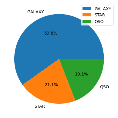
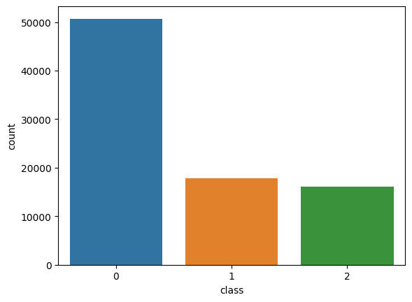
Looking to the label we can see that the data is really unbalanced, almost the 60% of the rows are galaxies, and 19% are Quasars. This is a problem that we are going to attack in the future, at the moment of training a model, but for now we are going to take a look to the other features.
Once we analyze a bit the label, now we can focus in the features, in this graph we analyze the distribution and density of each feature in relation to the target label. Although this graph is comprehensive, it provides valuable insights. On the left side, you can see the feature densities represented by Kernel Density Estimation (KDE) plots. These plots showcase how each feature’s distribution varies across three classes and provides an aggregated view across all classes. On the right side, histograms illustrate the same distributions. This visualization is powerful for assessing feature importance and linear relationships with the label.
Future Selection
1
2
3
4
5
6
7
8
9
10
11
12
13
14
15
16
17
18
19
20
21
22
23
24
25
26
27
28
29
30
31
# Select the features you want to visualize in the plots
features = df.drop('class', axis=1)

# Mapping of real labels to desired labels
label_mapping = {0: 'Galaxy', 1: 'Star', 2: 'Quasar'}

# Create a grid of subplots
fig, axes = plt.subplots(nrows=len(features.columns), ncols=2, figsize=(12, 2*len(features.columns)))
fig.subplots_adjust(hspace=0.5)

# Iterate through the features and generate plots
for i, col in enumerate(features.columns):
    # KDE Plot
    ax1 = axes[i, 0]
    for label_value, label_name in label_mapping.items():
        sns.kdeplot(data=df[df["class"] == label_value][col], label=label_name, ax=ax1)
    sns.kdeplot(data=df[col], label="All", ax=ax1)
    ax1.set_title(f'{col} KDE')
    ax1.legend()

    # Histogram Plot
    ax2 = axes[i, 1]
    for label_value, label_name in label_mapping.items():
        sns.histplot(data=df[df["class"] == label_value][col], bins=25, color='blue', alpha=0.7, ax=ax2, label=label_name)
    sns.histplot(data=df[col], bins=25, color='red', alpha=0.5, ax=ax2, label="All")
    ax2.set_title(f'{col} Histogram')
    ax2.legend()

plt.tight_layout()
plt.show()
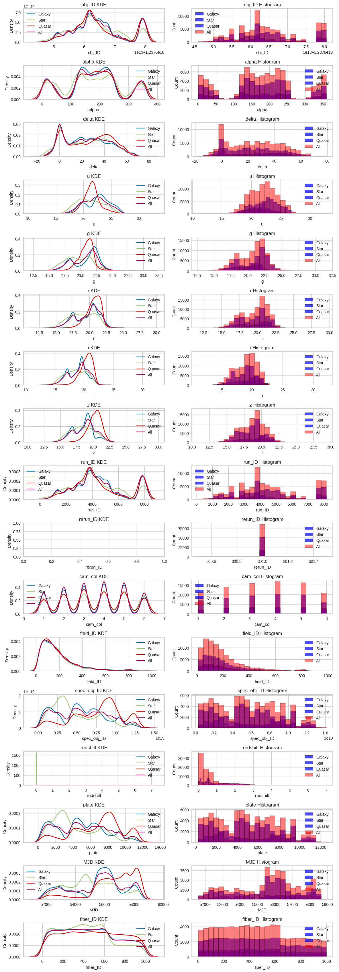
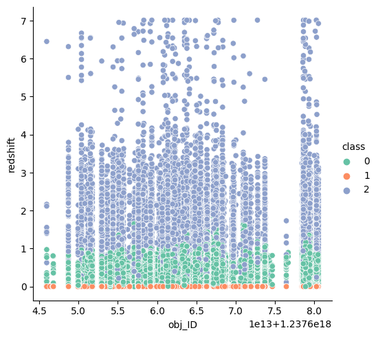
Putting more focus on the density graphs, we have to analyze the linear relation with the label, for example, in “obj_id” we can see that for any value of “obj_id” the label hasn’t any variance. The density at different values of “obj_id” is always the same for the 3 classes (the 3 classes follow the same trend), from this we can take that this feature might be quite useless for the variance of the label.
We can see something similar for “alpha” and “beta”, we know that these attributes define the location where the celestial object is in the space, and with these graphs we can say that the location of the celestial object isn’t an important feature to define if it’s a galaxy, star, or quasar.
There are some features that follow this trend (“run_Id”, “cam_col”, “field_Id”, among others), some of them because there are just identifiers or not useful features for the model but important for some astrologers.
But some features that we can clearly see that might be important for the label, for example: “u”, “g”, “r”, “i”, “z” and “plate”. For example, in case of “plate” we can see a lot of variances throughout the values of the plate, from values from 2000 to 4000 we can see that we have high probabilities that is a star, and from 7000 to 9500 might be a quasar. This can be seen in the features mention earlier.
Looking to the correlation matrix we get the following results.
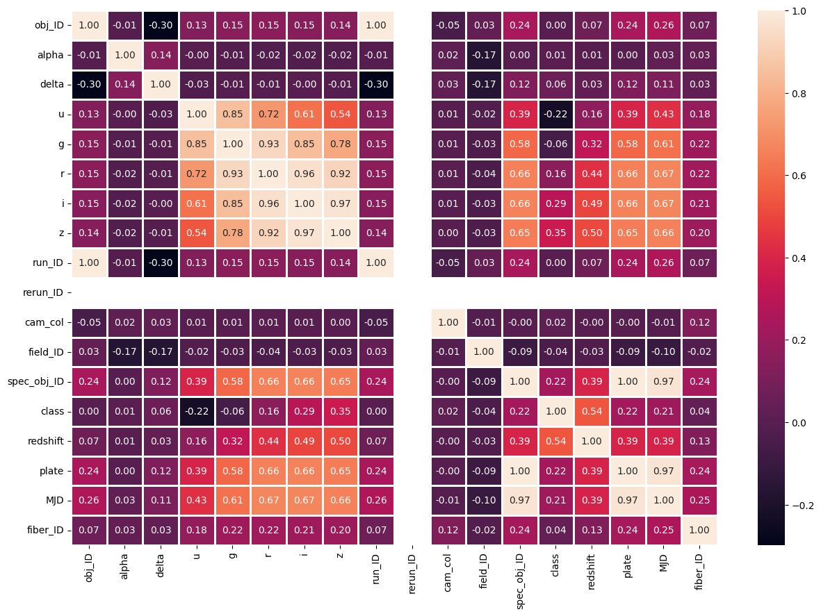
As I said, some of the features that we already mention are the ones which are the more correlated, but “redshift” has the highest correlation among all the features, this means, that it has a lot of weight in the decision of the label with a 0.54, taking a closer look into this feature we get the following graph.
0for Galaxy,1for Star,2for Quasar.
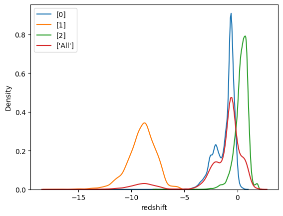
Now that we take a closer look, we can clearly see the separation in density for different values of the redshift, from -15 to -5 we can see the density skyrocket for Star, whereas from -3 to -0.5 it seems to be a Galaxy, and for values exceeding 1, it’s probable that is a Quasar.
In this other graph you can easily see the separation between the redshift value and the classes.
Based on these graphs we can conclude that there is a strong linear correlation between the redshift and the label
From these graphs we concluded which features we are going to use on the models, we get rid of the others because there are ids or others because don’t have almost any correlation with the label.
Dealing with unbalanced data
As we observed from the earlier pie chart depicting the labels, it is evident that our dataset suffers from class imbalance. This graph provides a clearer representation of the same imbalance.
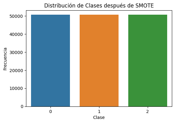
For that reason, we need to resample the data. Now, we have two options: Oversampling and Undersampling. Oversampling involves increasing the number of samples in the minority class, which is the class with fewer examples, in order to balance the class distribution. This is typically done by duplicating or generating new samples for the minority class. On the other hand, Undersampling reduces the number of samples in the majority class, the class with more examples, with the same goal of achieving a balanced class distribution. Undersampling usually involves randomly removing samples from the majority class.
One of the reasons why I opted for Oversampling over Undersampling is that I wanted to retain all of the data. Undersampling could certainly be considered in this scenario, as we have a substantial number of rows that we could potentially remove.
In this case we are going to use SMOTE for the Oversampling method
1
2
3
4
5
6
7
8
smote = SMOTE(random_state=42)
X = df.drop('class', axis=1)
y = df['class']
X_resampled, y_resampled = smote.fit_resample(X, y)
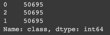
print(y_resampled.value_counts())
1
2
3
4
5
6
7
8
y_resampled_df = pd.DataFrame({'class': y_resampled})

plt.figure(figsize=(6, 4))
sns.countplot(x='class', data=y_resampled_df)
plt.title("Distribución de Clases después de SMOTE")
plt.xlabel("Clase")
plt.ylabel("Frecuencia")
plt.show()
This are final dimensions of the dataset, without outliers, with the selected features, and with the oversample data.
1
2
X = X_resampled[['u', 'g', 'r', 'i', 'z', 'redshift', 'plate']]
X.shape

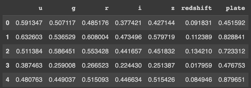
As a critical first step before diving into the realm of machine learning, it’s essential to normalize our dataset. This foundational process ensures that all data features are effectively scaled, typically within a common range from 0 to 1. The reason behind this practice is to create a level playing field for machine learning models, preventing any single feature from unduly influencing the results. So, before we embark on our modeling journey, let’s make sure our data is on the same page.
1
2
3
4
5
6
7
df=X.copy()

scaler=MinMaxScaler()
for i in ['u', 'g', 'r', 'i', 'z', 'redshift', 'plate']:
    df[i]=scaler.fit_transform(df[[i]])

df.head()
Model Prediction
In this section, we will focus on model prediction. We will be working with six different models, each chosen for its specific characteristics and suitability to our dataset and goals. Our objective is to thoroughly examine and evaluate the performance of these models to determine the most effective one for accurate predictions. This process is a crucial step in our analysis, and we will approach it with precision and objectivity.
1
2
3
classes = ['GALAXY','STAR','QSO']

X_train, X_test, y_train, y_test = train_test_split(df, y_resampled, test_size=0.3, random_state = 42)
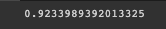
Naïve Bayes
To kick off our analysis, we initiate the process with Naive Bayes as our first algorithm of choice. Naive Bayes provides an initial evaluation for our data exploration and prediction, setting the stage for a comprehensive evaluation of our modeling techniques.
1
2
3
4
5
6
7
from sklearn.naive_bayes import GaussianNB
modelNB = GaussianNB()
modelNB.fit(X_train, y_train)
y_pred4 = modelNB.predict(X_test)
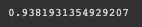
gnb_score = recall_score(y_test, y_pred4, average = 'weighted')
gnb_score
1
2
3
4
5
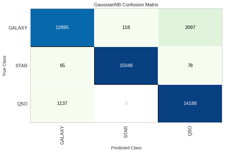
NB_cm = ConfusionMatrix(modelNB, classes=classes, cmap='GnBu')
NB_cm.fit(X_train, y_train)
NB_cm.score(X_test, y_test)
NB_cm.show()
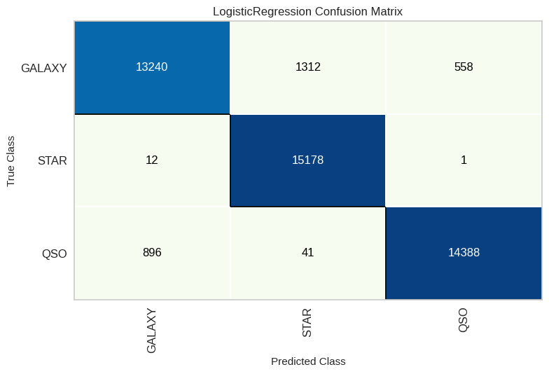
Logisitc Regression
Following our initial exploration with Naive Bayes, we proceed to implement Logistic Regression as the second algorithm in our analysis. Logistic Regression offers a different perspective and approach to our predictive modeling, enhancing the comprehensiveness of our evaluation and providing valuable insights into our dataset.
1
2
3
4
5
6
7
modelLR = LogisticRegression(max_iter=1000)
modelLR.fit(X_train, y_train)
y_pred1 = modelLR.predict(X_test)
from sklearn.metrics import recall_score
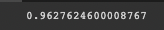
LR_score = recall_score(y_test, y_pred1, average='weighted')
print(LR_score)
1
2
3
4
5
NB_cm = ConfusionMatrix(modelNB, classes=classes, cmap='GnBu')

NB_cm.fit(X_train, y_train)
NB_cm.score(X_test, y_test)
NB_cm.show()
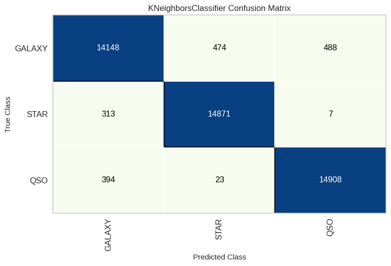
KNN
As we continue our journey through the world of predictive modeling, our next destination is K-Nearest Neighbors, often referred to as KNN. KNN is our third algorithm choice and offers a unique approach to understanding our data and making predictions. This transition allows us to explore a different facet of our dataset and expand our modeling horizons.
1
2
3
4
5
6
modelknn = KNeighborsClassifier(n_neighbors = 1)
modelknn.fit(X_train, y_train)
y_pred2 = modelknn.predict(X_test)
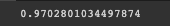
knn_score = recall_score(y_test, y_pred2, average='weighted')
print(knn_score)
1
2
3
4
5
knn_cm = ConfusionMatrix(modelknn, classes=classes, cmap='GnBu')

knn_cm.fit(X_train, y_train)
knn_cm.score(X_test, y_test)
knn_cm.show()
Decision Tree
As we progress in our predictive modeling journey, our next destination is the Decision Tree algorithm. Representing the fourth step in our analysis, Decision Tree introduces a tree-like structure that simplifies complex decision-making. This transition provides us with a structured approach to unraveling patterns within our dataset, offering a clear and interpretable pathway for making predictions.
1
2
3
4
5
6
7
from sklearn.tree import DecisionTreeClassifier
modelDT = DecisionTreeClassifier(random_state = 30)
modelDT.fit(X_train, y_train)
y_pred3 = modelDT.predict(X_test)

dtree_score = recall_score(y_test, y_pred3, average='weighted')
print(dtree_score)
1
2
3
4
5
DT_cm = ConfusionMatrix(modelDT, classes=classes, cmap='GnBu')

DT_cm.fit(X_train, y_train)
DT_cm.score(X_test, y_test)
DT_cm.show()

Random Forest
As we delve deeper into the world of predictive modeling, our next stop is the Random Forest algorithm. Random Forest, the fifth pick in our toolbox, takes an ensemble approach by uniting multiple decision trees to offer a powerful blend of robustness and precision. With this shift, we aim to tap into the collective wisdom of these trees, supercharging our predictive abilities and uncovering more insights within our dataset.
1
2
3
4
5
6
7
8
from sklearn.ensemble import RandomForestClassifier
modelRF = RandomForestClassifier(n_estimators = 19, random_state = 30)
modelRF.fit(X_train, y_train)
y_pred5 = modelRF.predict(X_test)

from sklearn.metrics import recall_score
rf_score = recall_score(y_test, y_pred5, average = 'weighted')
print(rf_score)
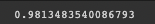
1
2
3
4
5
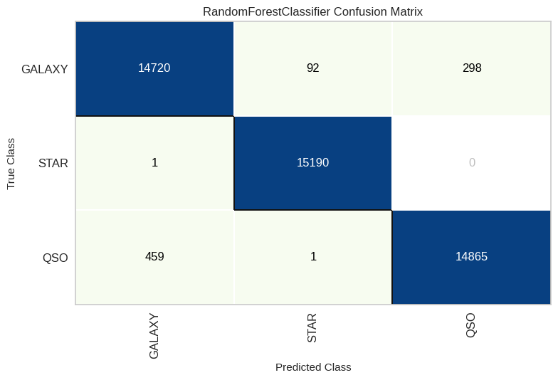
RF_cm = ConfusionMatrix(modelRF, classes=classes, cmap='GnBu')
RF_cm.fit(X_train, y_train)
RF_cm.score(X_test, y_test)
RF_cm.show()
XGBoost
As we step into the prediction game, let’s shine the spotlight on XGBoost as our sixth and final algorithm. XGBoost is famous for its gradient boosting technique, which injects some serious predictive mojo into our analysis. This boosts our capabilities and lets us dive even deeper into our dataset.
1
2
3
4
5
6
7
8
import xgboost as xgb
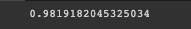
modelXG = xgb.XGBClassifier(random_state = 42)
modelXG.fit(X_train, y_train)
y_pred6 = modelXG.predict(X_test)
from sklearn.metrics import recall_score
xgb_score = recall_score(y_test, y_pred6, average = 'weighted')
print(xgb_score)
1
2
3
4
5
XG_cm = ConfusionMatrix(modelXG, classes=classes, cmap='GnBu')

XG_cm.fit(X_train, y_train)
XG_cm.score(X_test, y_test)
XG_cm.show()

Results
From our thorough performance analysis, including percentages and the confusion matrix, we’ve gathered some insightful findings. Notably, XGBoost and Random Forest emerge as the top-performing models, showcasing remarkable predictive power. However, it’s equally remarkable that even the ‘underdog,’ Naïve Bayes, achieved a commendable accuracy rate of 92%, which is quite impressive!
Delving into the nuances revealed by the confusion matrix, a distinct trend becomes apparent. When the model is predicting ‘Star,’ its accuracy is remarkably high. In our best-performing model, the number of stars correctly predicted was a mere 70 out of 15,165, resulting in a strikingly low error ratio of 0.46%. On the other hand, for classes such as ‘Galaxy,’ the error ratio is notably higher at 3.297%, signifying a more challenging classification task. These findings shed light on the strengths and intricacies of our predictive models.
Conclusion
In this part of our journey through predictive analysis, we’ve covered significant ground. We began by acquainting ourselves with the SDSS dataset and its diverse array of features. Employing the Local Outlier Factor (LOF) for outlier detection, we achieved remarkable results. Subsequently, we delved into a comprehensive feature analysis, aided by correlation matrices, to gain deeper insights.
Addressing the challenge of data imbalance, we skillfully mitigated it through oversampling techniques. This laid the foundation for our in-depth exploration, utilizing six distinct algorithms to navigate the augmented dataset.These crucial actions not only refined our dataset but also prepared us for the last stage of predictive modeling and model evaluation.