Titanic - Machine Learning from Disaster

Titanic - Machine Learning from Disaster
The Titanic dataset presents an intriguing opportunity for data exploration, in this post we are going to dive into the preprocessing using Python. Our goal is to get hands-on with the Titanic dataset, understand its ins and outs, and make informed predictions about whether passengers survived or not. As we navigate through this dataset, we’ll handle the data, create models, and unveil the intriguing tale of the Titanic.
Metadata Dataset
- Survived – Survival (0 = No; 1 = Yes)
- PassengerId – Identification number for each person
- Pclass – Passenger Class (1 = 1st ; 2 = 2nd ; 3 = 3rd )
- Name – Passenger Name Sex – Sex (male of female)
- SibSp – Number of Siblings/Spouses Aboard
- Parch – Number of Parents/Children Aboard
- Ticket – Ticket Number
- Fare – Passenger Fare
- Cabin – Passenger Cabin
- Embarked - Port of Embarkation (C = Cherbourg; Q = Queenstown; S = Southampton)
Input data
Firstly, we are going to import the two datasets, one for training called “train.csv” and other for testing called “test.csv”. This dataset has the advantage that already the data is divided in both separated csv.
1
2
3
4
5
6
7
8
9
10
11
12
import numpy as np
import pandas as pd
import seaborn as sns

from matplotlib import pyplot as plt
sns.set_style("whitegrid")

import warnings
warnings.filterwarnings("ignore")

pd.read_csv("train.csv")
pd.read_csv("test.csv")
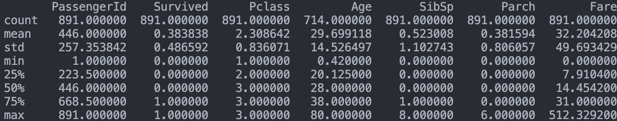
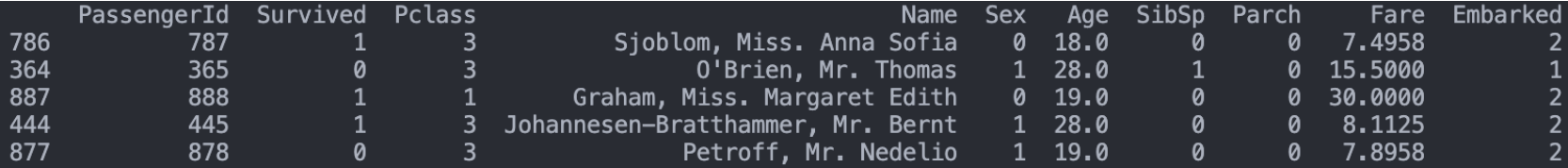
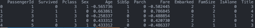
To check that both sets were loaded correctly, we are going to use the the .head() function to print the first lines of the training csv.
1
print(training.head())

Clickthe image to watch it fullscreen.
Missing Values
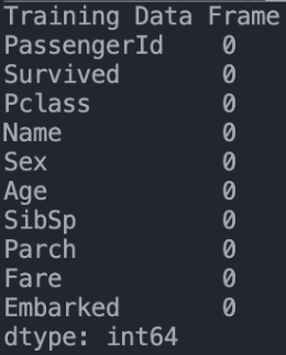
Now the problem to attack are the missing values, as you can see, the datasets could be loaded correctly and even some useful analytical statistics were shown for the future. But now we will have to analyze what these values are, how important they are for the label and, of the most important things, what quantity they are.
As you can see, the column “Cabin” Bene many missing values, there are several ways to deal with these values, one of them is the imputation, using different methods to implement them, another method is to simply ignore the column, something that in some situations can be useful if there are too many missing values or it does not have much relevance in the objective variable.
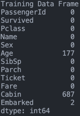
On the other hand, the column “Age” has much less quantity and it is a vital column for the label variable, in this case the imputation can be applied. But in the case of “Cabin” it is better not to take it into account. Here we also get rid of “Ticket” because it’s not giving us any information useful for the model, it’s only a identification number for the entry.
1
2
training.drop(labels = ["Cabin", "Ticket"], axis = 1, inplace = True)
testing.drop(labels = ["Cabin", "Ticket"], axis = 1, inplace = True)
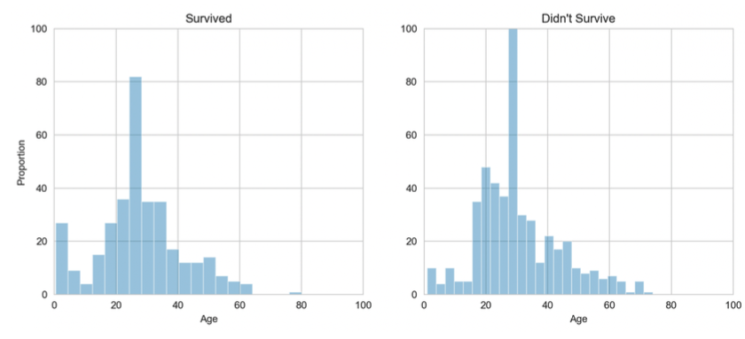
We already know that there are not many missing values in the “Age” column, but to be more precise in deciding what kind of imputation to do, we first have to look at the ranges and distribution of the data in the column.
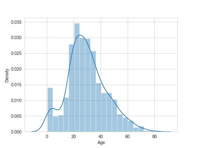
As you can see in the graph, the ages are a bit skewed to the right, so taking the mean may not be the best option, because as we know in these cases high values have a lot of weight in the mean. On the other hand, the median may be more accurate when replacing this missing values. Although it is known that it is not ideal to impute data, the median is the best option.
1
2
3
4
5
6
training["Age"].fillna(training["Age"].median(), inplace = True)
testing["Age"].fillna(testing["Age"].median(), inplace = True)
training["Embarked"].fillna("S", inplace = True)
testing["Fare"].fillna(testing["Fare"].median(), inplace = True)

null_table(training, testing)
Data Visualization
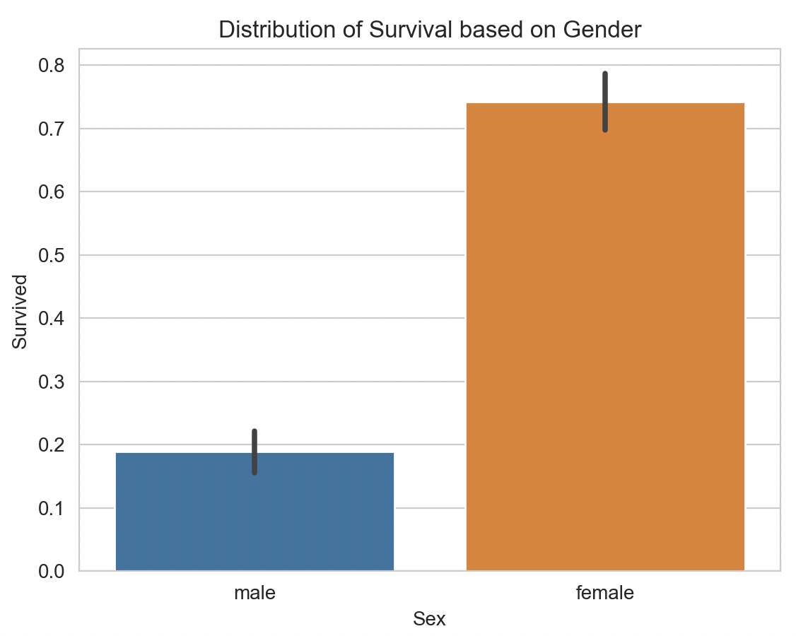 It is important to analyze and visualize through graphs the data that we are going to use in our model, in this way we can find some important finding that can influence the model, for example, we can see how important are the attributes “Age” or “Sex” through which graphs. In other case perhaps it’s easier to use the correlative matrix to find this influence on the label, but here thanks to the understanding of the data I can know for sure that the age and sex of the person it’s very important for the label. As we can see the “Sex” column is very striking in terms of the results, and based on this graph we can draw the conclusion that this attribute is vital in predicting the label.
1
2
3
4
5
6
7
8
9
sns.barplot(x="Pclass", y="Survived", data=training)
plt.ylabel("Survival Rate")
plt.title("Distribution of Survival Based on Class")
plt.show()

total_survived_one = training[training.Pclass == 1]["Survived"].sum()
total_survived_two = training[training.Pclass == 2]["Survived"].sum()
total_survived_three = training[training.Pclass == 3]["Survived"].sum()
total_survived_class = total_survived_one + total_survived_two + total_survived_three
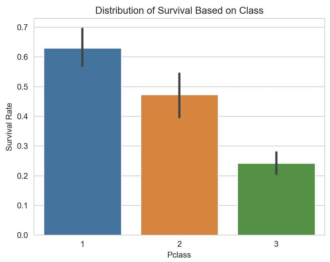 Similar to the previous concept, we can see how class is also a key attribute in predicting whether or not you survived, since the large number of people who lived were in class number “1”, with a survival rate of just over 0.6.
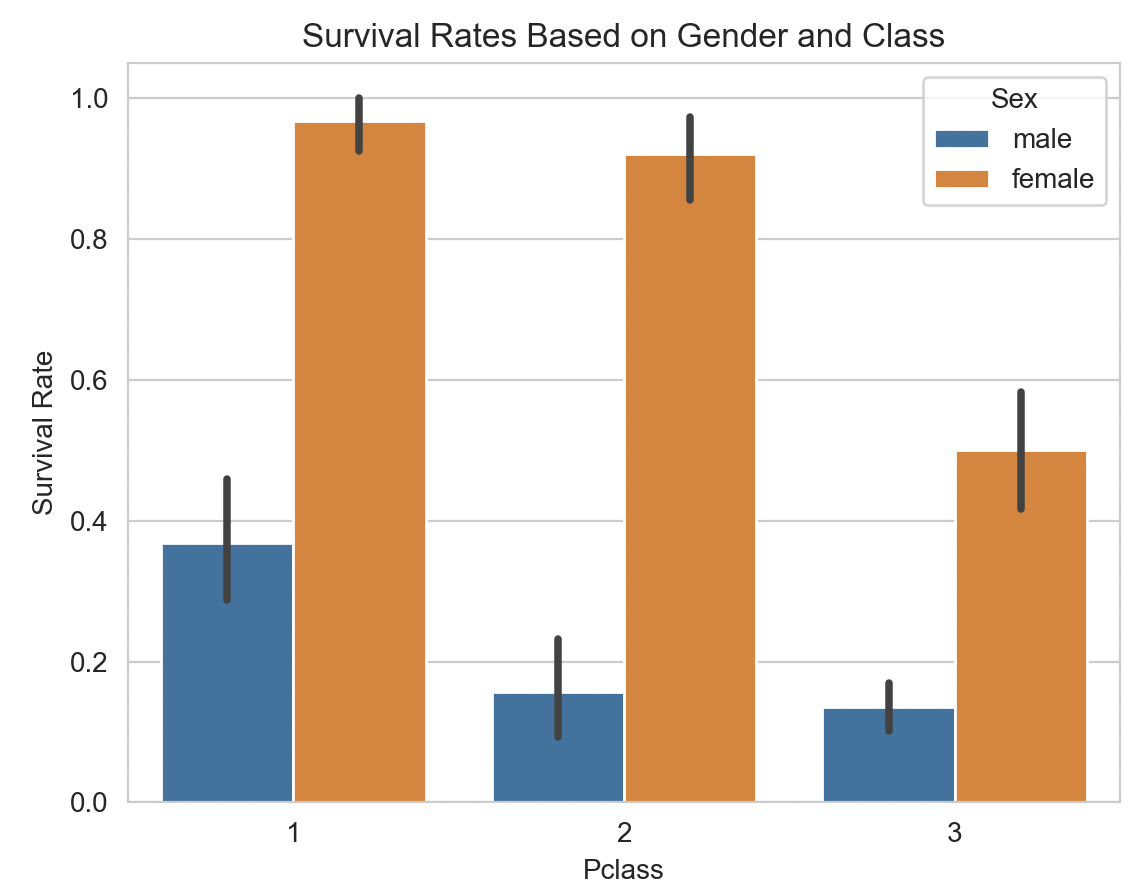
Analyzing more on other attributes such as “age”, we get these results:
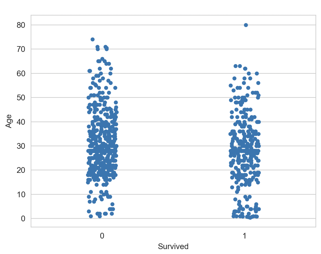
Based on these graphs we can analyze that age was another important factor in predicting whether a person survives or not, as we can see the younger the person is the more likely to survive.
Adapting for Models
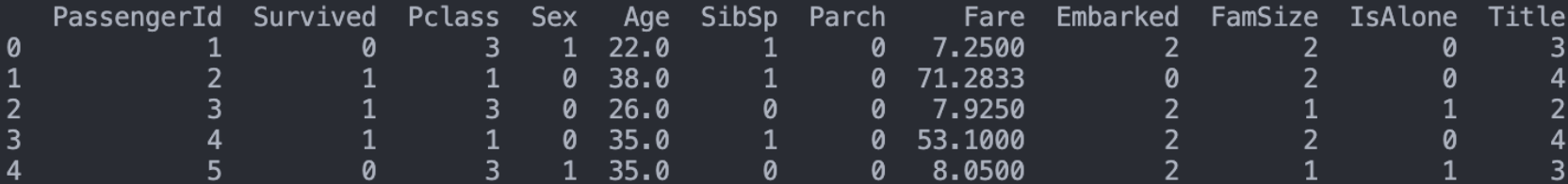
Before starting to apply any model for the datasets, we must first make sure that the data types of the columns are valid for certain models, in this case both the “Sex” and “Embarked” columns are categorical values, but for the classification model, it needs numerical values. In this case the female value of “Sex” is going to be 1, while male is going to be 0. While the “Embarked” column, the possible values are “S”, “C” and “Q”, in this case we are going to change them as 1, 2 and 3 respectively.
Another problem is that both “SibSp” and “Parch” are quite similar attributes, something we can solve by making both columns join in a column called “Family Size”. At the same time we can make a new column that contains the information if the passenger was traveling alone or accompanied, a useful attribute thinking about the models used.

Looking at the “Name” column, although it seems that there is no useful information in it, if we look at the title that the names have (such as “Mr” or “Ms”) can give us valuable information of the attribute. So what we can do is to delete the attribute “Name” and add a new column “Title” that simply says what title has each person without taking into account their real name, plus we would be transforming all the columns into numeric values (as it will be implemented as a dictionary where each title has an index).
Normalize Data
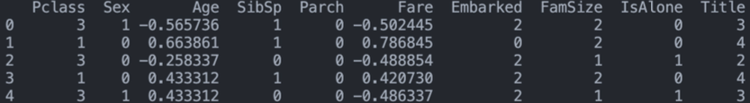
Another problem to be solved comes from the “Age” and “Fare” columns since, as can be seen, the values vary greatly in range and this can cause inaccuracies when modeling. Therefore, the best thing to do is to normalize these attributes in a range from -1 to 1.
Now the data with these changes will bring better results in the model as we lower the weight of the magnitudes!
Model Prediction
Before getting into the model, we will first indicate which is the label and we will eliminate both the PassengerId and the label.
A very easy mistake to make is to over-fit the models, as they would be too rigid to the training data, so it is useful to have a third dataset called validation test where we will make sure that we are not going to over-fit the data. To do this we will test many models with cross validation and verify which one is the most accurate.


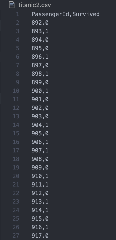
As can be seen the highest score was obtained by XGBoost followed by Random Forest and SVC, to predict we used the SVC model, issuing a csv with the results obtained by this model in the test dataset. results obtained by this model in the test dataset. This csv has 418 lines where the columns “PassengerId” and the objective variable “Survived” are located.